Video for Church

Former user wrote on 9/27/2012, 7:57 AM
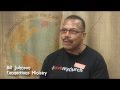
I know some of you do videos for your church. Our church does an annual call for volunteers, and I am shooting and editing a series of 4 videos. This is a link to the first one. All edited on V11 on 32bit. The background was a burlap cloth and I used the mask and some overlays to add the graphic.

There are a couple of jumpcuts because I didn't shoot enough cover, but felt the message was more important than the technical aspects of it.

Let me know if you have any questions, otherwise, enjoy.


]

Dave T2

Comments

Tim20 wrote on 9/27/2012, 8:32 AM
At :50 there is a nasty artifact that pops in for a few seconds. Might want to take a look at fixing it.
Former user wrote on 9/27/2012, 8:43 AM
Tim20,

Thanks. I did not post the video so I will have to contact someone else about reposting it.

Dave T2
Laurence wrote on 9/27/2012, 9:49 AM
Looks great. I get artifacts like the one mentioned in the earlier post if I am smart-rendering to XDCAM .mp4.
video777 wrote on 10/1/2012, 11:22 PM
There is a lot to like about this video. One suggestion for the video as a whole is to mix the interviews together. What I try to do is to keep like comments together. For example, when I do videos for our local homeless shelter I typically start with "The Need." The first time each person comes on the screen I have their name and title but generally not any other time. The first person will say, "One of the problems in this area..." The next person says, "I couldn't believe what I saw..." The final person shares their thoughts. Then I move from how great the need is to ways each person is involved. I generally conclude with what it means to them. For example, "Since I've been working with... I have felt like I'm really making a difference." "It makes me feel good to know that I'm touching the lives of people in our community."

Technical stuff (I think there were a few more and the major one was already mentioned)
At 1:00 there is a dissolve; probably to cut out something. Then at 1:04 there is a jump cut. Suggestion: cut to some B-roll (aka other footage) starting at some point before 1:00 and going through 1:04.

The second volunteer section is very nice except the jump cuts at 2:18 and 2:56. I really like the B-roll that you have here and your timing. It helps to tell the story and is done well.

When the last guy is saying his name I would let him finish before cutting to the ending text.

The bottom line: With some polish this would be an excellent video. As it is now it is very good and gets the message across; which is most important. I like to work out any of those little bugs before showing it to the public. Good work and thanks for sharing.
Former user wrote on 10/2/2012, 7:46 AM
Video777,

Thanks for your comments. Most of the tech issues I was aware of (other than the hit in the video, that was a corrupt file in the version they uploaded). As far as the jump cuts, I shot the b-roll before the interviews because of scheduling and did not have enough to cover, but as I mentioned, felt the message was more important. Under that b-roll there are several cuts in the audio. I had a length restriction as well as unscripted people who are not comfortable on camera.


I have tried both ways for different projects, grouping ideas to tell the story and keeping each individual separate. In this case, I chose the latter. With the amount of unseen cuts to tell the narrative, this way probably worked better. But I might do a re-edit for my own practice.

I don't mean to diminish the value of your comments though. Most of the things you brought up were all considerations I dealt with during the shooting and editing.


Thanks again for watching and for your insights.

Dave T2
Laurence wrote on 10/2/2012, 8:49 AM
I wouldn't change a thing. I love the graphics overlaid over the burlap.
Former user wrote on 10/2/2012, 10:52 AM
Laurence,

Thanks much, the burlap worked out far better than I hoped.

Dave T2
michael-wildermuth wrote on 10/2/2012, 7:31 PM
Thank you. I was curious about "I used the mask and some overlays to add the graphic." Would you add more explanation? I was impressed with how the person truly looks to be in front of the graphic and would have thought of using the chroma keyer for this effect. I would like to know how you did this with a mask.

I did a similar video for my church:

Laurence wrote on 10/2/2012, 7:50 PM
I did this one for a big outreach program in Tampa last Christmas. I absolutely was going nuts trying to deal with the little see-through bits of hair. I eventually gave up totally on that idea and left the green screen as the background and made it into a wall and put some Christmas props into the frame so that it would look like a fireplace and a tree against a green wall. The chroma key separation is all below the head and neck on the outer body and the hands:

Former user wrote on 10/3/2012, 6:39 AM
John,

I will be glad to expand. Give me couple of days to gather some screen shots and I will post more information.

Yeah, your video is very similar, although you are a lot braver in your closeups. Looks good.


Dave T2
Former user wrote on 10/3/2012, 9:02 PM
Brief overview of how I achieved background effect.

No effect- Original shot


Timeline- Track 10 is duplicate of track 6. On track 9 I put a moving light effect, made in B&W in the media pool effx, Used OVERLAY for the composit mode and mixed it at 46.8%. Track 8 is the graphic at 21.2% normal composite mode and then track 6 is where I added the mask.


Light layer This shows track 10 and 9 which is the light effect.


images


Graphic Layer- This shows 10 9 and 8 with light and graphic effect.


Final layer-This shows the final effect.


Mask- the mask is done on track 6, feather set for both at softness of 17. Occasionally I had to keyframe to keep their head or hands from being mixed in too much with the effects.


Let me know if you have any other questions.

Dave T2
Laurence wrote on 10/3/2012, 9:46 PM
Thanks for the visuals. One thing that surprises me is that burlap background looks as bad before the overlay as it does good afterwards. I hate the look of the burlap before the overlay and I really love it afterwards. What a difference!
michael-wildermuth wrote on 10/3/2012, 11:21 PM
Thanks, Dave.

I remained surprised at how good the finished product looks and would not have thought of this combination myself. I go to bed wiser.

I appreciate you taking the time to explain in detail.

Best wishes,
Laurence wrote on 10/3/2012, 11:47 PM
Another thing that I see now is that the overlay actually lightens the backdrop and the non lightened part around the mas ends up looking like a shadow. This "shadow" explains to our eyes why the overlaid graphics kind of fade away in that area. It also makes the subject stand out more against what otherwise might have been too dark a background. Very nice indeed.
Former user wrote on 10/4/2012, 7:50 AM
John,
Thanks, I was happy with it which is why I posted it. To maybe let other people who do free or church stuff know what you can do with very little.

Dave T2
Former user wrote on 10/4/2012, 7:54 AM
Laurence,

When I got back at looked at the raw footage, my first though was holy c**p, what have I done. But I was lucky in that the graphic itself lent itself to this type of look.

With the moving highlights, which enhances the shadows also, and the mask, your eyed is fooled into thinking that the graphic is falling off into the folds of the burlap. Also, the soft edge around the people where the mask is appears to be a shadow, again adding contrast and dimension.

But basically, I got lucky.

Thanks for your feedback.

Dave T2
Laurence wrote on 10/4/2012, 8:16 AM
Well that is one lucky accident that I will try to copy.
Former user wrote on 10/4/2012, 9:01 AM
I would like to see it when you get it done.

Dave T2
Laurence wrote on 10/4/2012, 9:18 AM
Here is another video where the green screen gave me fits. What I ended up doing was to just separate the greenscreen via chromakey and made it black and white, then vignetted the outside of the frame. It looked way better than the green. In this paricular instance, I couldn't get clean enough edges to put in a different background. As you can see, a little black and white touch here and there where the keying was off is hardly noticeable and much preferable to a bad key overlay.

Anyway, my idea inspired by your work would be to use a greenscreen instead of the burlap, separate it, lower the saturation for black and white, then overlay a lighter semi-opaque graphic like the one you did with similar masking and maybe a bit of tinting. It might be just the thing for dealing with interviews where you can't get a good key.

https://vimeo.com/31463140
Former user wrote on 10/6/2012, 8:12 AM
Yeah, this works pretty well.

I avoid chroma key if possible. I like organic approaches as much as possible. It works for this video because it looks like you treated the boys interview footage as well, so it gels well.

thanks
Dave T2
SWS wrote on 10/6/2012, 11:21 AM
"...avoid Chroma key if possible." Wow you got that right!

Did this kids vid at church a few years ago. As W.C. Fields said..."never work with kids or chroma keys." Well it was something like that!


BOXX/APEXX S4
Motherboard: ASRock TAICHI
Intel Z690 Chipset Cores:16
CPU: Intel Core i9 12900KS Enhanced Performance Processor
GPU: NVIDIA GeForce RTX 3090
RAM: 64GB DDR5-4800 MHz (2 - 32GB DIMMS
Disks: 2.0TB SSD NVMe/PCIe 3.0/4.0 M.2 Drive
SSD: (4) 4TB
O/S: Microsoft Windows 10 Professional 64-bit SP1