-- AFM, ASCAP, BMI, ACB, CMEA, Retired. I've paid my Dues
-- Vegas Editor since 2001 (Sonic Foundry Vegas Video 2)
-- Film and Imaging QA / Technical & Training Certifications
Technicolor Corp., Eastman Kodak, Inc., Noritsu, Pako, Hope Industries, Gretag Macbeth, CPI, Pallas Chicago/Denver, Phototron, QMI, Royal Color.
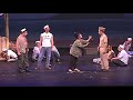
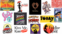
-- Regional Music Direction / Production Credits: West Side Story (1996), The Who's Tommy (1998), Anything Goes (1998, 2000), Personals (2000), Suds (2001), Broadway Then and Now (2001), Joseph and the Amazing Technicolor Dreamcoat (2002), Fiddler on the Roof (2003), Little Shop of Horrors (2004), South Pacific (2005), Hello, Dolly! (2005), Grease! (2006), The Sound of Music (school, 2007), Jesus Christ, Superstar (2007), A Funny Thing Happened on the Way to the Forum (2008), The Fantasticks (2009), The Enlightenment (Regional Premiere, 2010)
-- Highlight Reel 2000-2010 (Deinterlaced and Upscaled to 720p from NTSC DVD)
-- Note: Set the Youtube Player to 720p (it defaults to 360p)
My Vegas Articles
Adding Player Chapter Markers to MP4 files
HDR Banding Target for Post Production
Color Management of non-sRGB Stills
60p Player Stress Test
LUT to Remove HDR10
How to Open Twitter TS Files in Vegas
 Color Profile LUTS for Vegas
UPDATED ~~ Fixing the "Pale Screen of Misery" ~~
Why don't my broadcast and PVR recordings work in Vegas?
Free Video Levels Tool for Vegas
HDR to 8 Bit Grading Tip -- Reclaiming the Shadows
Monitor Calibration on the Cheap -- a Windows 10 Tutorial
New Users Please See the Tutorials First
\\\\\ Zebras in Post? \\\\\
Software Deinterlacer Shootout 2019
Wagging the Dog -- Effects of Hyperoptimal Upload Bitrates on Youtube Quality
RGB / YUV Intermediate Codec Shootout - 2018
Speaking Good Video -- a Beginner's Guide
PC to TV Levels -- A Comedy of Errors
10 Bit vs. 8 Bit Grading -- The Musical
This is Not About Grading
Seven Lossless Codecs Rendering Comparison (2011)
Posterization in Vegas
Math Quiz for Editors
Monitor and Viewing Conditions for Color Correcting (not updated yet)
Original compilation of YUV Levels resources (2011) by amendegw and jazzy (Archive, a few broken links)
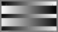
A useful printer, monitor, and video levels target. 8 bit 4:4:4, 6400x3600 (16x9). Download: https://drive.google.com/open?id=1A_Ey6sbchy-5EU2jFrdOenaUwsYSnH2a
My free dual range RGB YUV grayscale and stepwedge for handoff, screens, and printers
Better Clipping Demo (using Photoshop Action)

Other Published Resources Compiled by Nick, Set, et al
How do I Get Firewire DV/HDV Capture Working?
How to Disable so4compoundplug.dll
How to Post File Properties in Vegas
How Can I Reset Vegas to Default Settings?
VEGAS PRO FAQ AND TROUBLESHOOTING GUIDES
IMPORTANT! INFORMATION REQUIRED TO HELP YOU
Set's Vegas Pro Tutorial list
Official Vegas Video Tutorials
Tested OBS Studio Settings for Vegas